Striking Beauty: The Power of Asymmetrical Balance in Design
Introduction
When we think of balance, we often imagine symmetry, a perfectly mirrored image or arrangement. However, asymmetrical balance in design has its own unique power and appeal. Asymmetry can create a sense of movement, dynamism, and even surprise. In this article, we will explore the concept of asymmetrical balance in design and its various applications.
Definition
Asymmetrical balance refers to a type of visual balance in which elements on either side of a central axis differ in size, shape, color, or texture, but still achieve a harmonious composition. Unlike symmetrical balance, which is often static and predictable, asymmetry can create a dynamic sense of tension and interest.
Applications
Asymmetrical balance can be found in a variety of design fields, including graphic design, interior design, and fashion design. In graphic design, asymmetry is often used to create a sense of movement, depth, and hierarchy. For instance, designers may use asymmetrical balance to draw attention to a particular element, such as a title or call-to-action button.
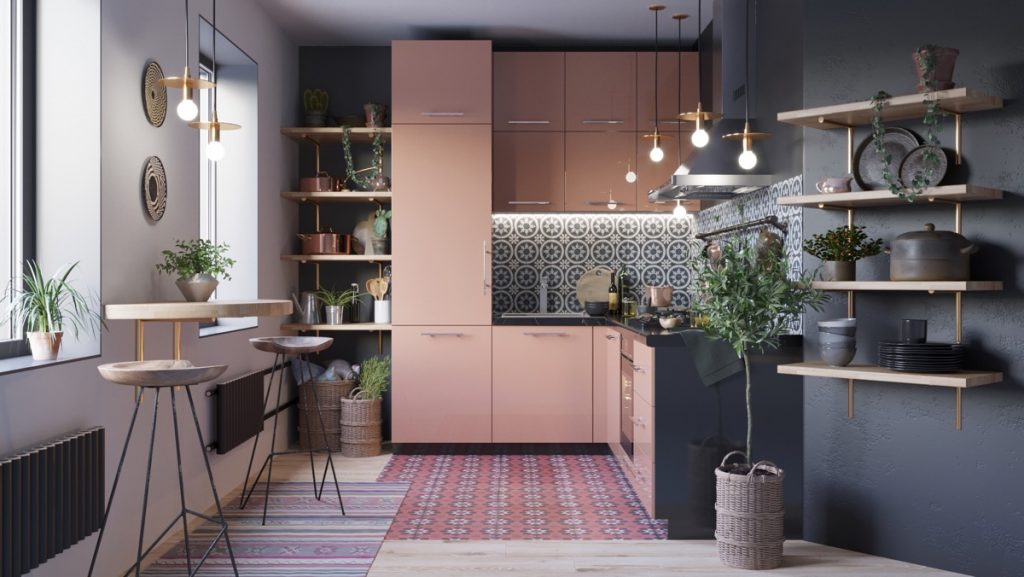
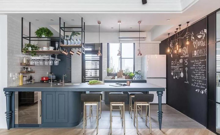
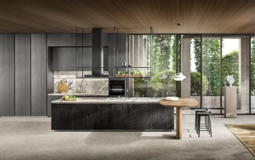
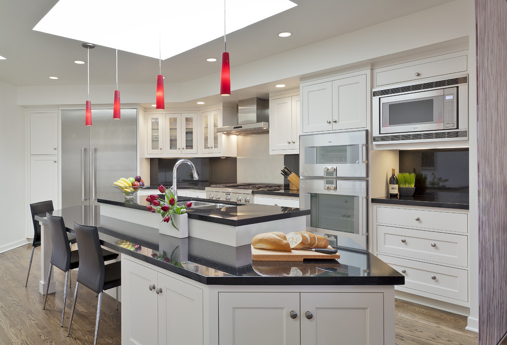
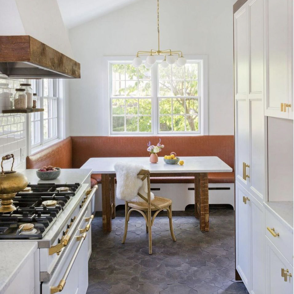
In interior design, asymmetry can help break up monotony and add visual interest to a space. An asymmetrical grouping of furniture, for example, can create a sense of flow and movement. In fashion design, asymmetrical elements, such as one shoulder or hemline, can add drama and flair.
Techniques
Creating effective asymmetrical balance requires a careful balance of elements. Some techniques that designers may use include:
Size and placement
One effective technique is to use different-sized objects on either side of the central axis. For instance, a large object on one side can be balanced by several smaller objects on the other side. Placement is also important: objects should be carefully arranged to avoid clutter or confusion.
Color and texture
Another way to create asymmetrical balance is to vary the colors or textures of elements on either side of the axis. Contrasting colors, for instance, can create a strong sense of tension and interest.
Visual weight
Visual weight refers to the perceived importance or presence of an element in a design. For example, a heavy, dark object may have more visual weight than a small, light one. Designers can use visual weight to create a sense of balance despite varying sizes or shapes.